Design Systems / Case Studies
8.0 Kin - Perils Design System
Kin is an insurance technology startup based in Chicago, IL. Kin specializes in home insurance for properties that are especially exposed to climate related risk. As one of the highest rated customer satisfaction home insurers in the country, a cohesive customer (user) experience was essential for the overall success of the business.
My Role
Head of Design / Senior Product Designer
Collaborators: Peter Binkowski - Front End Developer

8.1 Primary Goals
-Create a cohesive user experience across all Kin digital platforms
-Provide documentation, source of truth and logic related to Kin’s UX/UI design decisions
-Create a central location where all of Kin’s components, icons and UI patterns can be accessed and easily implemented
-Oversee and maintain the Perils Design System
8.2 Constantly Evolving
The Perils Design System had been in existence before I started working at Kin. The team that was there before I arrived had laid the foundation for a design system that would ultimately serve every key department within Kin: marketing, legal, agents and customer service reps, product, engineering and design. With so many digital surfaces both internally and externally, it was important for Kin to have a central location for all of its UI elements and components. The elements are not only the building blocks for all of Kin’s digital products but also the building blocks and components that make-up Kin’s customer (user) experience. All of these digital surfaces, interfaces and customer experiences bundled together make up what we often refer to as a “brand”. A design system is a system that is designed to be able to consistently generate favorable user experiences and ultimately positive emotions related to companies and brands and the products and services they offer.
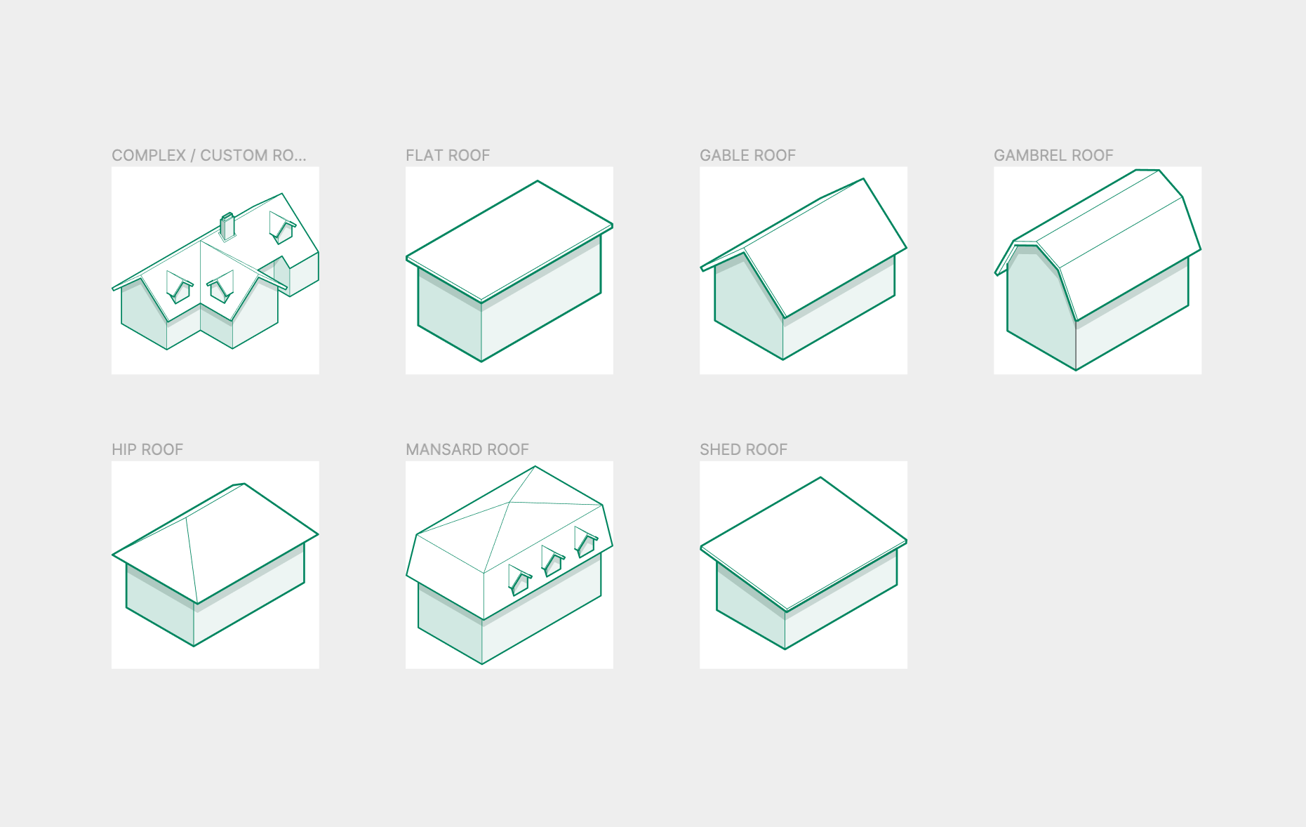
Pictured Below: Roof Illustrations - Customer Funnel

8.3 The Results: Recognizing the Importance of a Design System
Questions related to the quality of a company's user experience, customer experience or overall brand effectiveness should always be traced back to the design system. Oftentimes I see companies spending more time on “decorating trees versus designing seeds”. I believe in a more proactive design approach and less of a reactive one, especially related to design systems. For consistent, scalable and long term user experience solutions it is better to put your focus and resources on the design system, making sure any updates can be cascaded throughout your products and customer (user) experiences as easily as possible. Ease-of-use and executability from an engineering standpoint are also extremely important. At Kin we constantly worked to improve and maintain our design systems for the betterment of our customer’s user experience, engineering implementation and the overall success of the business.
Accomplished Goals:
√ Create a cohesive user experience across all Kin digital platforms
√ Provide documentation, source of truth and logic related to Kin’s UX/UI design decisions
√ Create a central location where all of Kin’s components, icons and UI patterns can be accessed and easily implemented
√ Oversee and maintain the Perils Design System


9.0 Cyberhedge - Design System
Cyberhedge is a finance technology start up with offices in Washington, DC, London, Luxembourg and New York City.
Cyberhedge helps corporations protect their most valuable asset - technology. These digital assets in their most vulnerable state are varying degrees and traces of connectivity. Railways, roads, train departure boards and other non digital forms of connectivity were explored and discussed throughout the design process.
My role
Head of Design
9.1 Primary Goals of a Redesign
Create one uniform brand aesthetic that other products and brand elements can be built from
Create a digital platform that comprehensively conveys Cyberhedge’s products and services
Incorporate Cyberhedge’s brand aesthetic in all aspects of the company website
Create a design system that could be managed by a small in-house design team
9.2 Design Approach
Clean and Minimalistic - Russian Constructivism & Suprematism Influences
The brand design proposal was to be minimalistic and clean. Influences were taken from Russian Constructivism Architecture, as well as influences from Russian Suprematism artists like Kazimir Malevich. The aim was to take straight forward rigid elements from this architectural style and use that as a backdrop to the overall aesthetic of the brand. At one point in the project Suprematism and Constructivism literature were used as a source of inspiration for needed complimentary UX design colors. The design system was intentionally built to be easily managed by a small in house design team.
9.3 The Results
Goal 1: Create one uniform brand aesthetic that other products and brand elements can be built from
A brand guide was created that incorporated several aesthetics and attributes that we identified during the brand development process. Those brand elements were later used when we built out the design system that would support all of our products.
Goal 2: Create a digital platform that comprehensively conveys Cyberhedge’s products and services
A modern, user tested and approved customer facing website, digital magazine and product dashboard platform were designed to work for mobile and desktop seamlessly.
Goal 2: Incorporate Cyberhedge’s brand aesthetic in all aspects of the company website
I created a design system flexible enough to handle all of our digital platform needs while conveying the aesthetics and brand attributes created during the branding development phase.
Goal 3: Create a design system that could be managed by a small in-house design team
The design system was built in Figma with several sharing and editing capabilities built in.
Cyberhedge Brand Design Guide Work Below:


10.0 5thColumn - Brand Identity
Not all the brands I work with start in the same place. When I started working with 5thColumn they already had a lot of their visual brand elements established. We started with discussing where they were at in their business cycle as a start up and the specific goals they wanted to achieve with good design. After further discussions we started with actions revolving around messaging and advertisements associated with specific 5thColumn products and services. Proper Brand identity provides an essential foundation to a new or existing company that products and services can be built from in order to increase profits and reach company fiscal goals.
My Role
Lead Product Designer / Senior Brand Manager
10.1 Start-Up Life (Understanding the Challenges)
Oftentimes technology based start ups are still working through final testing before launching a digital product and are often running on extremely tight timelines. Considering brand messaging before the product design and development phase can be very impactful to a successful product launch. This can set the the tone for how the product is viewed holistically within an organization, how it will be used by users and ultimately how it’s launched to market, and how it fits into the bigger picture of brand and product offerings.
10.2 Primary Goals
-Improve organizational and product alignment through a cohesive brand identity
-Empower marketing with content for SEO, Social Media and Editorial purposes
10.3 Messaging (The Solution)
It is important to take in consideration the brand attitude. In this case we decided that it was important to spend some time considering the tone of voice and creative messaging so the client can come away with a number of powerful phrases that might speak to their audience in the proper way. This is not only helpful for our client to get a chance to step back and consider their company’s messaging from different perspectives, but also is essential in developing the proper tone in which the brand needs to communicate to its audience.
Example of Brand Messaging - ”Running Faster”

Two Different Design Approaches for Marketing Collateral:

10.4 Social Media
Strategized with marketing director on imagery and copy. Raised followers by 28% over a 6 month span, and began to incorporate analytics into all digital marketing decisions.


10.5 SEO / Content Marketing
The goal for this content outreach campaign was to build top-tier links with high domain authority. With mentions and link placements by other media sites, we could increase keyword rankings for the client’s most targeted search terms. The project tasks included research, content production and media outreach.
Implementation
I began by researching a core group of topics that relate to 5thColumn’s industry. Among the topics and phrases I gravitated towards were “cybersecurity” and “human factor”. There was a lot of coverage of cyber security from a technical perspective but very little focus on the human aspect of cybersecurity. I set out to learn more about how humans impact the overall effectiveness of cybersecurity initiatives in a corporate environment.
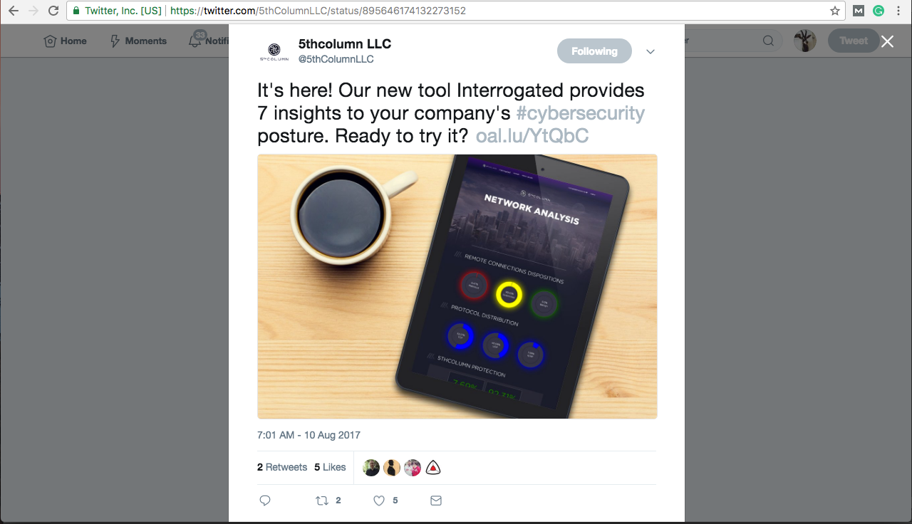
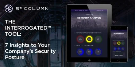
Pictured Below: “The Human Factor” Infographic that I designed for 5thColumn

My research unearthed a number of interesting data points related to humans and how they impact the overall effectiveness of cybersecurity. For example 49% off all attacks on a business are Malware related. What was interesting is that ALL of those Malware attacks can be directly traced back to human error. These errors were categorized by careless/uniformed employees (53%), accidental/loss of equipment (38%) and phishing/social engineering (36%).
Keyword Success
65% increase in keywords ranking 1-3 on Google
52 backlinks
40% increase in organic site traffic
All tracked keywords showed significant upward improvement in organic search results
10.6 The Results: Design Guideline Applications
Brand design guides can be difficult to navigate without seeing them implemented in a contextual application. The brand identity is much less likely to stray when the client can see what their advertising can look like, how their reports and data visualizations might appear and how their social media profiles, and messaging might manifest themselves.
Accomplished Goals
√ Improve organizational alignment through a cohesive brand identity
√ Empower marketing with content for SEO, Social Media and Editorial purposes

11.0 Climate Solutions - Brand Identity
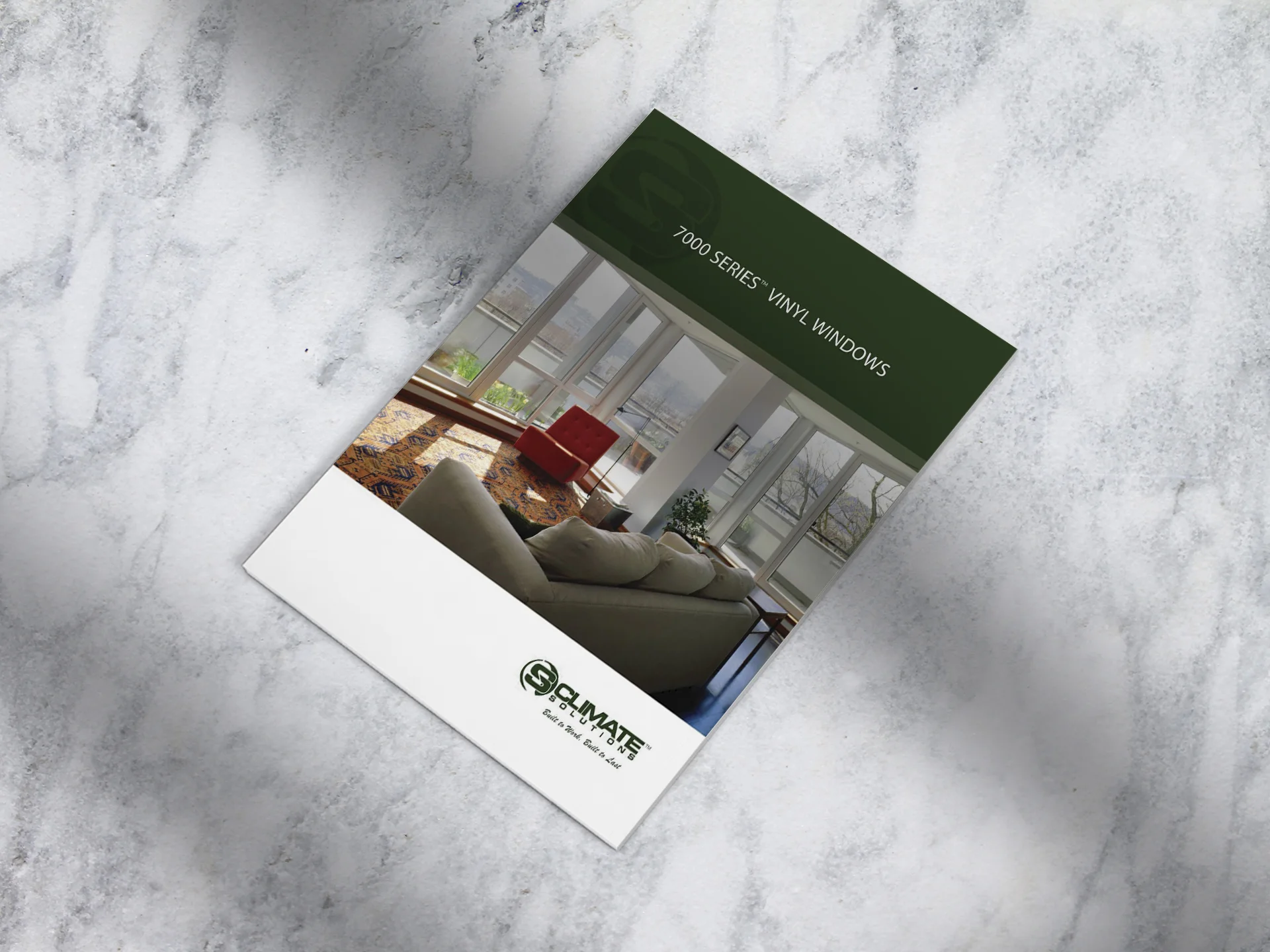
Climate Solutions is a B2B Chicago based custom window and door manufacturer. CS Windows & Doors sell directly to builders, architects and building professionals. In 2016, they hired me to do a brand identity redesign. There were a number of items that needed to be built out after the brand identity guideline was complete. Some of these items included product logo design and naming, brochure design, and website design.
My Role
Creative Director
11.1 Understanding the Challenges
Climate Solutions was in the process of developing new cutting edge building fenestration products and wanted a brand identity that matched these new and improved offerings. We worked together on the design and copy of the brochures along with strategy on best way to position the new products in the marketplace. There is a lot of competition in the window and door space and it was important for Climate Solutions to highlight product differentiators. Some of those product differentiators were the lifetime warranty that came with all of their products, fully customizable windows and doors, quick turnaround times and competitive pricing.


11.2 Primary Goals
-Create brand guidelines that will provide the foundation for all marketing materials and company website
-Develop naming and logo design around glass products
-Create various assets including brochures, warranty and product line brochures based on the brand guidelines
11.3 Design Guide Application - Limited Lifetime Warranty
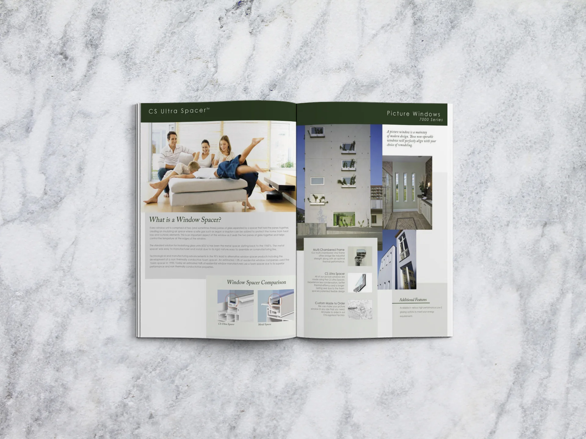
We took elements from our design guide and carried those over into a contextual application on a number of visual assets. One of those assets was the limited lifetime warranty. This warranty came with all of Climate Solutions products and was an important feature of Climate Solutions product that differentiated Climate Solutions products from its competitors.


11.3 Product Naming and Logo Design
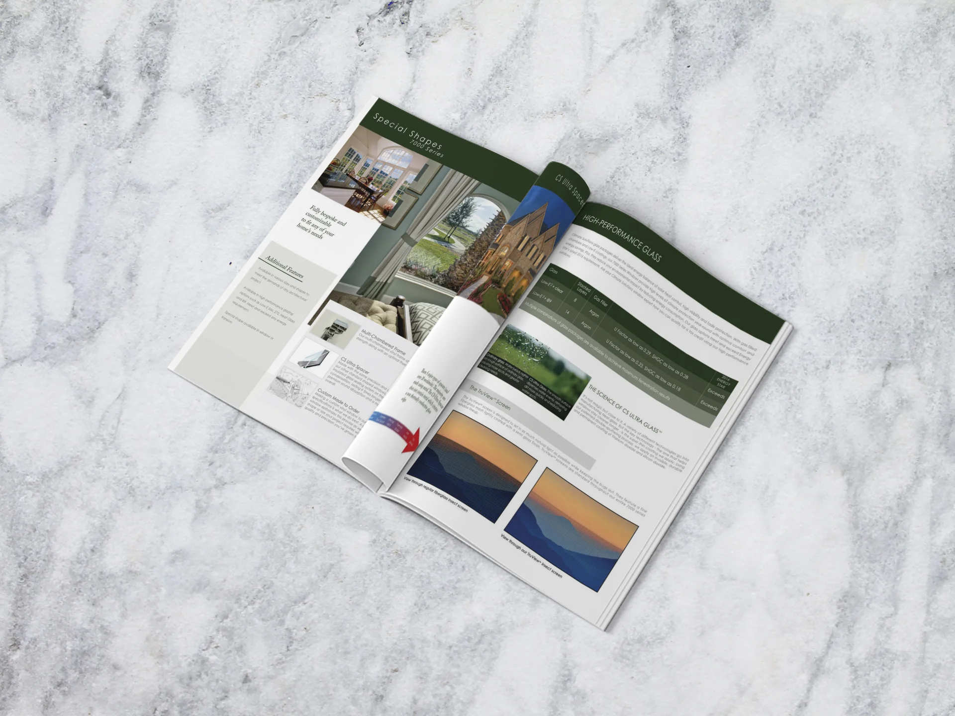
Climate Solutions offers a multitude of glass packages, they wanted logos and collateral to depict these packages and features. During the initial research phase I learned that glass makes up over 90% of a window's surface and the choice of glass package(s) typically is the biggest factor in price and performance. The goal was to give this important aspect of the windows its own identity. There were two types of glass that were manufactured with "glazing layers" providing varying degrees of protection from the sun and outside elements.
After gaining a better understanding of how glass is manufactured and its importance to the overall performance of windows and doors I began to explore various name options.
The Ultra Glaze-X8 and Ultra Glaze-X12 names best depicted these two types of glass with glazing layers. The Eco-View name and logo was designed to depict the self cleaning molecular attributes of the outside glass surface when in contact with rain. Rhino tempered glass speaks for itself.
11.4 The Results
Accomplished Goals
√ Create brand guidelines that will provide the foundation for all marketing materials and company website
√ Develop naming and logo design around glass products
√ Create various assets including brochures, warranty and product line brochures based on the brand guidelines
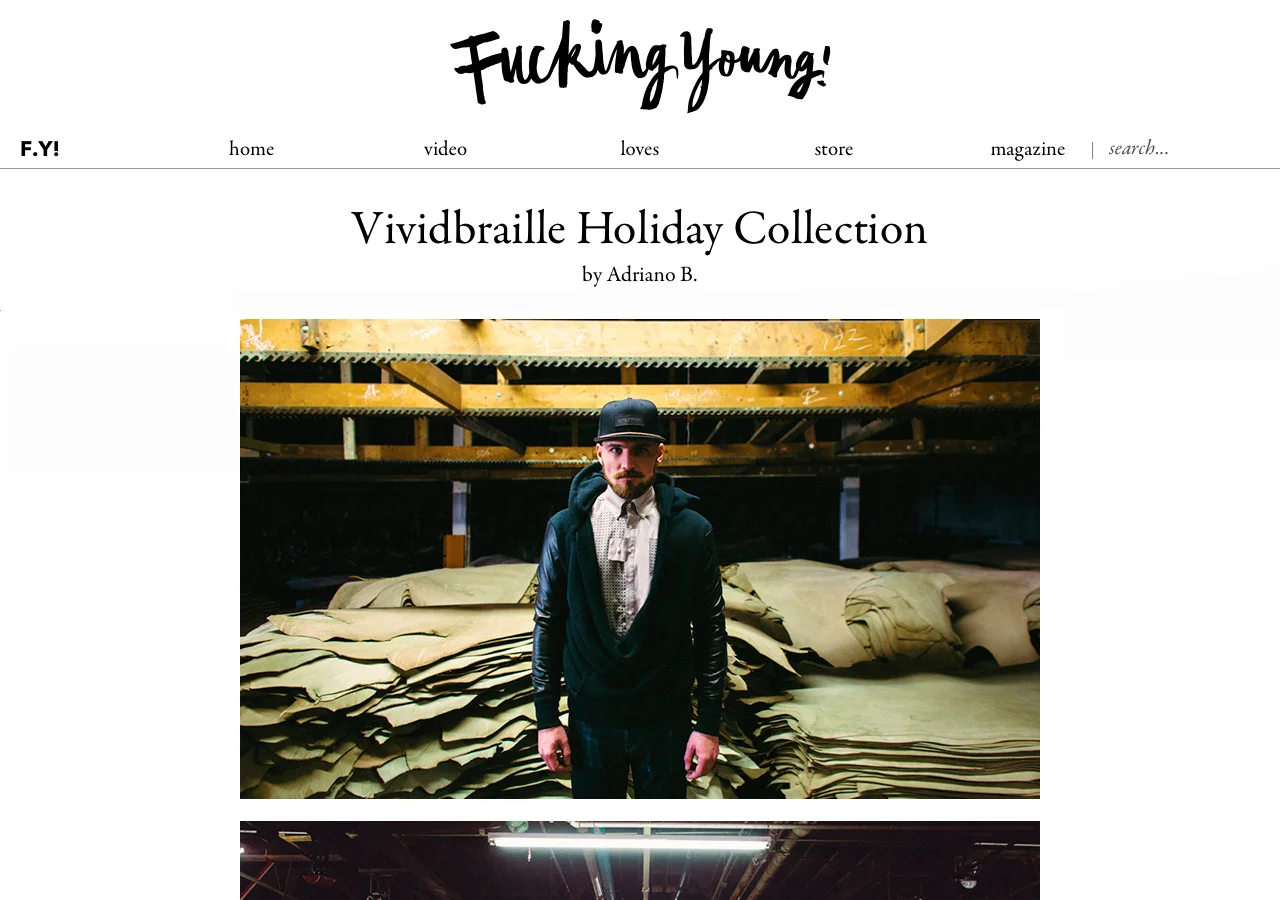
12.0 Vividbraille - Building a "Brand" (User Experience)
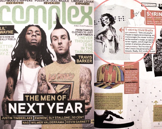
Vividbraille is a contemporary design and streetwear label. The brand started by selling limited hand printed tees and quickly grew into a full fledge cut and sew label for both men and women. In 2011 Vividbraille opened its first concept flagship store which was located on Damen Ave in the Wicker Park/Bucktown neighborhood in Chicago, IL. By 2013 the store was named a top 8 sneaker boutique in Chicago by Complex magazine while also receiving international recognition for its 2013 unisex collection photographed at the historic Horween leather factory in Chicago. The concept flagship store featured a 4 color manual screen printing press while selling world renown labels like Y-3, Opening Ceremony, Yuketen, Rick Owens x Adidas, Vans Vault, Saucony Elite and Public School.
Vividbraille Press Mentions:


My Role
Creative Director / Founder
12.1 Elements of a “Brand” (User Experience) / Understanding the Challenges
While developing Vividbraille I learned first hand that great brands are not built overnight and they aren’t built only because of good brand design guides, logos or websites. These visual assets are a really important first step that help create the foundation that companies can build from. When I complete and handover a brand identity project to a client I’m always sure to remind the client that these visual elements are ultimately theirs, not mine and that its up to them to maintain and develop the brand over time. Oftentimes after a brand identity is completed a client will hire me to ensure their brand is maintained properly for several months until they are ready to manage it completely on their own. With Vividbraille their were a number of things we did over the course of several years that contributed to the brand’s equity and customer (user) experience. Collaborations with more established brands, events, architecture, and great products were a few of these elements.
12.2 Primary Goals
-Develop credibility through key partnerships, events and superior product design
-Generate brand awareness and sales through memorable user experiences
-Collaborate with brands that share a similar vision in well crafted design while growing overall brand awareness
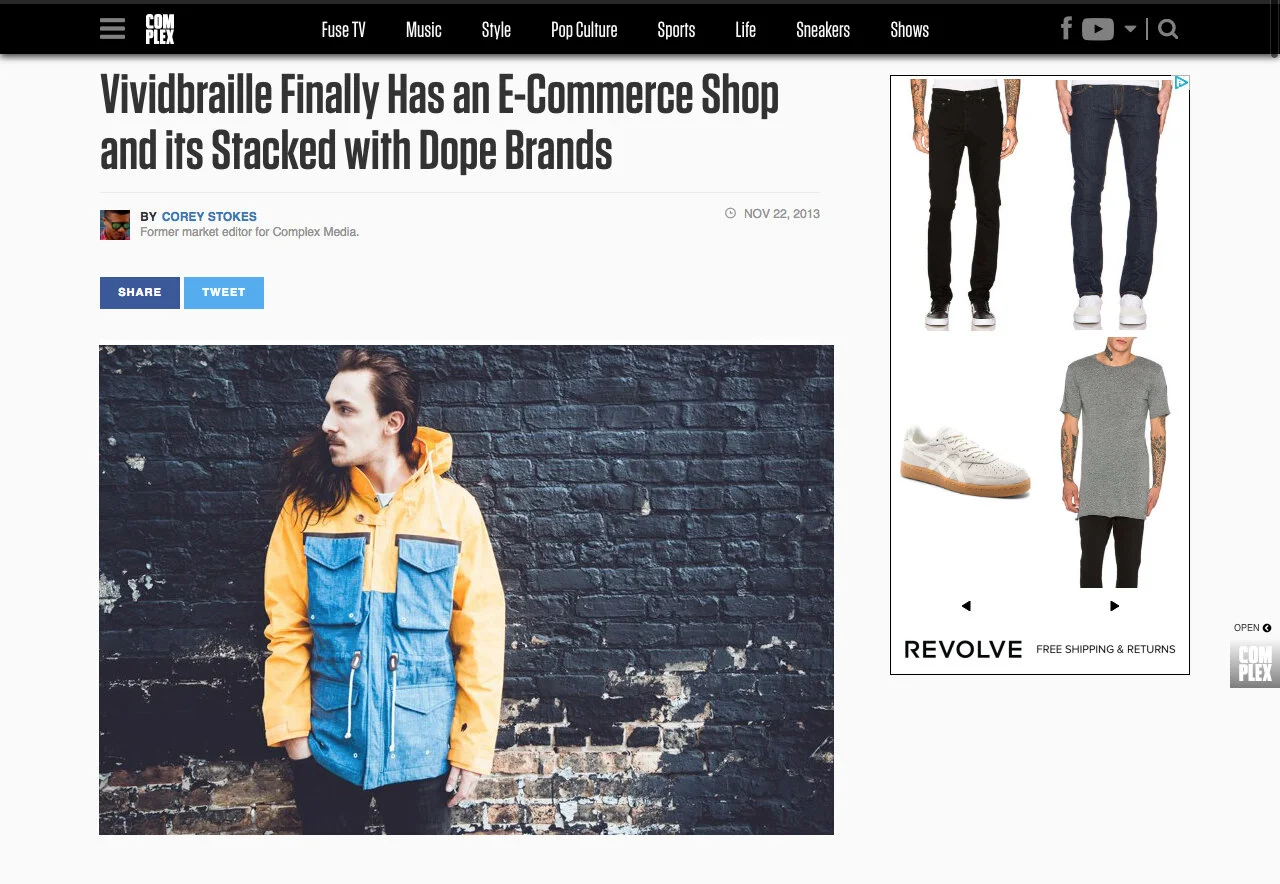
-Successful e-commerce website launch
Photographed Below: Launch of New Vividbraille Website on Complex.com
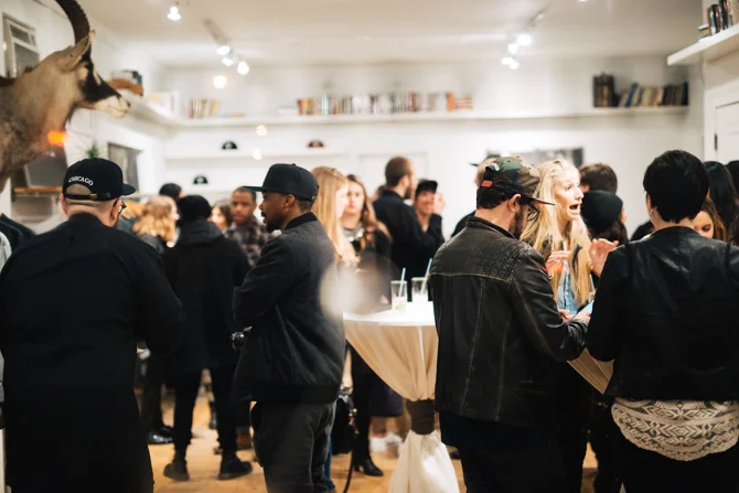
12.3 Collaborations
We partnered with several brands that we admired on a number of projects and events. Some of those brands included Opening Ceremony, Public School NYC, Soho House, Lincoln Motor Company, Vans Vault, Lexdray Luggage, Duluth Bags and Mount Gay Rum.
Vividbraille Event in Partnership with Mount Gay Rum


12.4 The Space
The concept space was referred to as a “Studio Boutique”. The idea was to serve walk in clients while also providing a studio space that allowed Vividbraille employees a space to execute various creative projects.
I integrated four main components into the Studio Boutique: A modern open layout, book shelving labeled by category, vintage furniture and a four color manual screen printing press.
A common theme with Vividbraille was telling the story behind its products. Many of the graphic t-shirts and apparel were thought provoking and had an element of sophistication. We thought it would be a good idea to pay homage to this aspect of the brand by building a “library” that ran along the top of the entire store and was labeled by category.
The vintage furniture added an element of home and an old world aesthetic. The furniture provided a pleasant contrast to the open minimalistic layout of the space and provided a balance in contrast to the modern apparel and footwear.
The screen printing press added to the space aesthetically but it was where all of our in house t-shirt apparel was printed by hand. Often times a customer would walk in the space while a Vividbraille employee was printing, this created an authentic experience for the customer seeing the products being made by hand.
12.5 Goals Accomplished
√ Develop credibility through key partnerships, events and superior product design
√ Generate brand awareness and sales through memorable user experiences
√ Collaborate with brands that share a similar vision in well crafted design while growing overall brand awareness
√ Successful e-commerce website launch
The exterior of the space had minimal signage. A braille neon sign being the most prominent.


