User Experience Design / Case Studies
1.0 - Kintranet Software
A significant aspect of my work at Kin was designing feature solutions for an internally used insurance policy administration platform - "Kintranet". This was used by all of our customer service agents who depended on the platform for its insurance management capabilities. Kin agents and customer service reps used the Kintranet throughout their day while handling customer service calls and managing insurance policyholders' accounts.
My Role
Senior Product Designer
Pictured Below: Apply at Renewal & Endorsement Feature Prototypes

1.1 Understanding the Problem
Up until recently, the insurance industry hadn't had the technology “disruptors” that several other older industries had experienced. Kin took on the challenge of using technology to better serve its policy holders while also providing better tools to empower its agents. Insurance can be very complex due to regulations (varying by state), outdated processes, old insurance jargon and several layers of documentation needed from both an insurance and finance standpoint.
1.2 Defining Primary Goals
Improve agent satisfaction and overall ease-of-use
Design new features while maintaining overall customer satisfaction and reducing average length of time per call
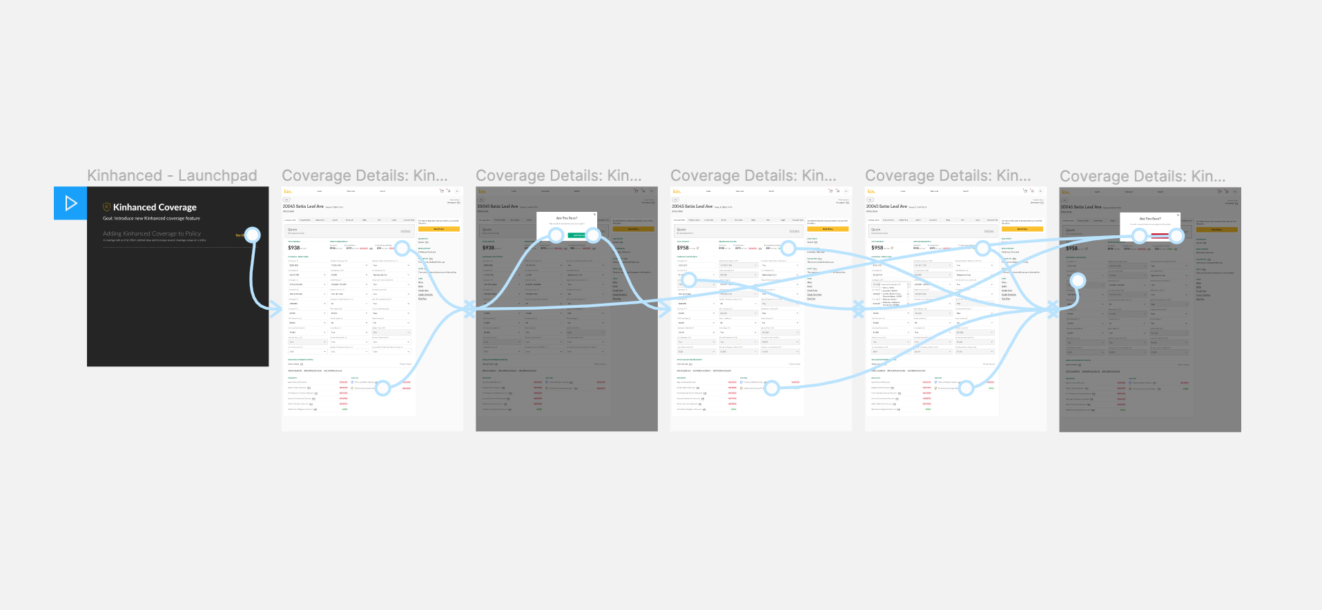
Pictured Below: Kinhanced Feature Prototype
1.3 The Result
When working on the Kintranet we were doing something few companies had ever done before: we were designing and building a custom insurance policy administrative system that served both its customers and agents better. We were handling new feature requests on a daily basis. Based on those requests we were proposing and testing design feature solutions with both our agents and customers. We were measuring things like call times, customer satisfaction and agent ease-of-use. Some of the features I designed included: a new and improved endorsement feature, flood coverage, renew policy, and a notes and follow-ups feature, just to name a few.
I worked closely with engineers on several of these features to ensure ease of engineering implementation. While the solutions varied with each feature and accompanying constraints, there were processes we implemented to ensure successful outcomes. Some of those processes included designing 2-3 prototypes, testing those prototypes with agents (users), making design improvements accordingly, and handing off designs to development that were user tested and ready for production.
Goal 1: Improve agent satisfaction and overall ease-of-use
Our agents and their feedback was an integral part of our design process. Throughout the design process we performed several user (agent) tests with our agents. We incorporated 1 on 1 and group feedback sessions into our entire product design process to gain better insights into what was and wasn’t working for our agents and making revisions accordingly. The majority of the time we were testing prototypes with our agents before the feature went into production.
Goal 2: Consistently design new features while maintaining overall customer satisfaction and reducing average length of time per call
We were not only measuring agent satisfaction but overall customer satisfaction & average length of time per call. While it was important to ensure our agents satisfaction, it was equally important to ensure our customers satisfaction on each call. Throughout my time working on the Kintranet we were able to maintain or improve overall customer satisfaction while we reducing average the average call length by 10%.
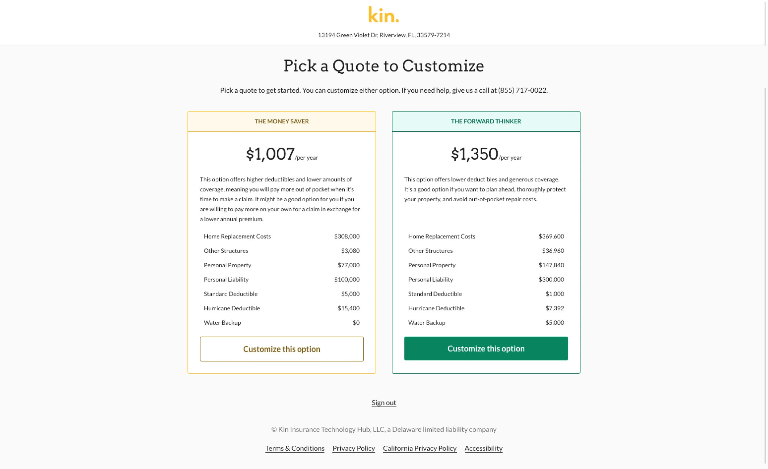
2.0 - Kin Customer Funnel - Mobile
Insurance policies at Kin can be written and bound (purchased) by contacting a Kin customer service agent or through the Kin website (Kin.com). The area on the Kin.com website where customers can get a quote and/or purchase an insurance policy was referred to as the customer funnel. The customer funnel was an exciting yet challenging project to take on and was particularly important to the business and overall digital user experience.
My Role
Head of Design
2.1 Understanding the Problem
Binding an insurance policy requires several things from the user and can be quite complicated. Depending on the state the users home is in adds an additional layer of complexity, as each state has their own set of requirements due to varying state regulations. The existing funnel needed updating to reflect the improved overall Kin customer experience. There were engineering and time constraints so it was important to design a solution that was not only user tested and approved but also executable from a development standpoint.
2.2 Defining Primary Goals
Improve policy binds rates & decrease bounce rates
Mobile friendly
Gain insights to improve current design system & overall user experience
Design tested and packaged for handoff to engineering
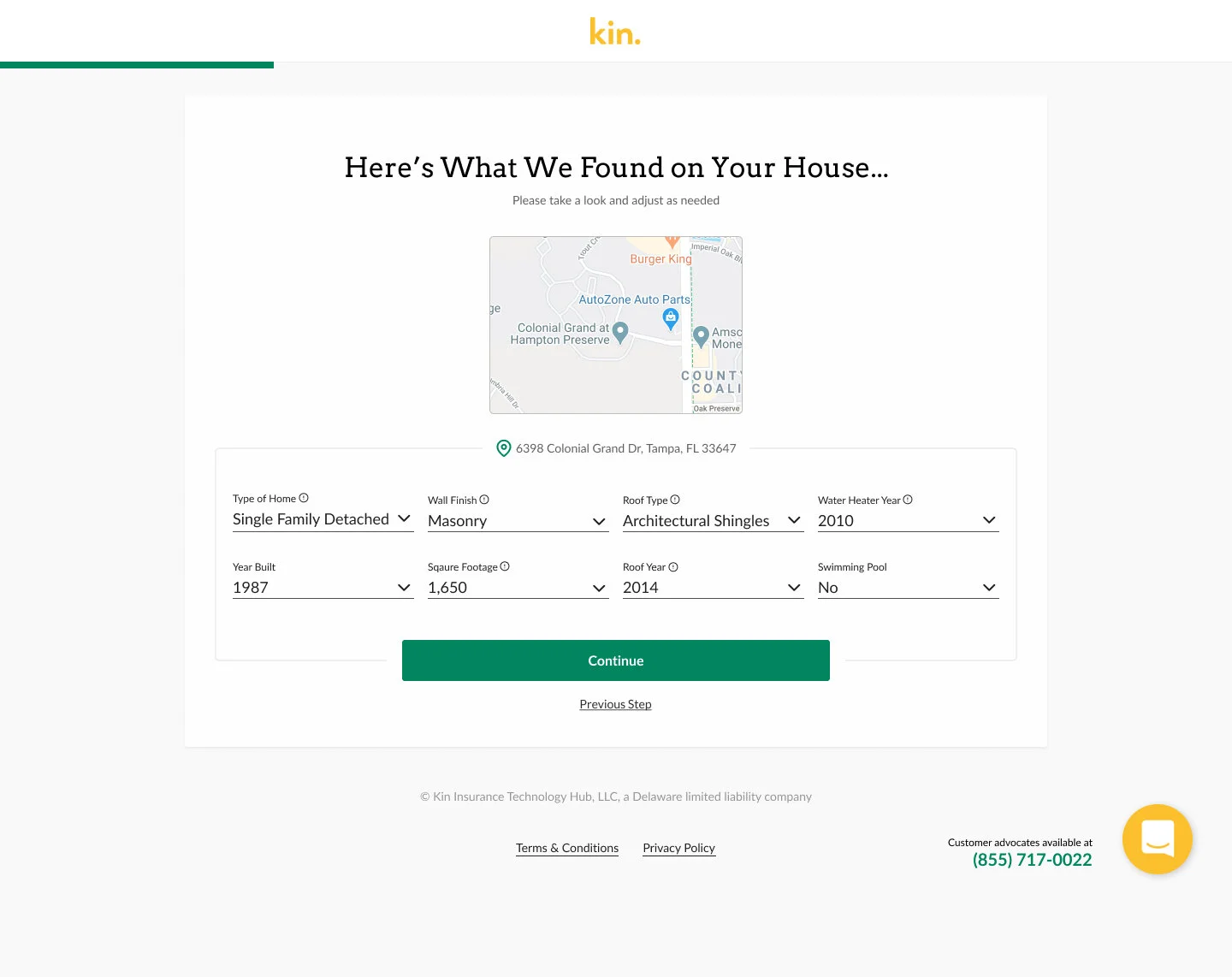
Pictured Below: Initial User Flow Mocks (Current Design vs Proposed Solution)

2.3 Exploring Possible Solutions
After looking at analytics and user testing related to the current funnel we were able to identify key areas of the funnel where users were most likely to bounce. We also knew that in order to improve policy bind rates we needed to reduce the steps it took for the user to bind a policy as this would significantly minimise the cognitive load on our users. After gaining a clear understanding of our goals, the most challenging aspects of the funnel and the necessary steps within the funnel I explored components, styling and layout ideas that would accomplish everything we set out to accomplish with this project.
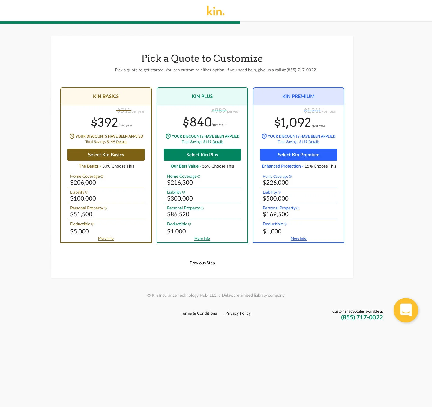
2.4 The Results
Goal 1: Improve policy bind rates & decrease bounce rates
We focused on 6 screens within the funnel where bounce rates were most prevalent: initial user information screen, the pricing screen, customizing your coverage, check your quote, mortgagee, and sign your policy. With the initial user information screen I focused on ensuring credibility, as trustworthiness and reliability were two of the top attributes our users look for when shopping for home insurance (based on previous user testing).
There were a total 4 screens that I was able to condense into two. I combined the customize your coverage and check your quote page into one page and gave the user the ability to easily adjust policy details on that same screen. I also combined the mortgagee page with the sign your policy page and did not ask for this information unless the user was selecting this option as a form of payment.
Pictured Below: Initial User Flow Mocks (Current Design vs Proposed Solution)


Goal 2: Mobile Friendly (Responsive)
Reduce input effort
When it comes to form design for mobile, the most important thing a designer can do is to minimize the need for typing and reduce input effort. I was able to achieve this goal by condensing the amount of steps (screens) within the funnel by almost 40% and reduce the total amount of inputs by over 45%.
Remove “required” input labels
We were also notating the majority of inputs as “required”. Instead, I removed all inputs that were not required to bind a policy and removed the “required marking altogether. In those rare instances where it is necessary to mark a field “optional” or “required” it is better to mark the field that is the exception to ensure lesser fields are marked. As a rule of thumb it is better to only ask for the information that is needed to complete the task and remove inputs that are not required.
Tool Tips
Another detail that we accounted for were tool tips. While the topic of tool tips can always ignite a casual conversation among product teams, our research indicated that our users were most familiar with this UI when it came to gaining further explanation related to unfamiliar insurance terminology. An example of this was when a user needed to select a roof type and wasn’t sure which type of roof they had.
Also, the inputs in our current design system were labeled on the inside which made accessing the tool tip by touch especially difficult. My design proposed new inputs that provided an improved user experience on mobile. We also worked to make all major touch points a minimum of 44 x 44 pixels (according to Apple’s Human Interface Guidelines) when scaled down to mobile.
Remove all horizontal adjacent fields, Consistent error messaging and loosen data validation rules
While not exclusively related to mobile, I made several other improvements to the overall user experience including: eliminating all horizontal adjacent fields throughout the entire funnel, streamlined all input error/validation messaging, loosened up some data validation rules.
Goal 3: Gain insights to improve current design system & overall user experience
There was a push to update our design system and to lead with a mobile first design philosophy. The funnel was a great place to test components and design styles while also testing the funnel as a whole. Upon completed on the funnel design we created documentation and updated our design system accordingly.
Pictured Below: Final Design for Kin Customer Funnel


Goal 4: Design tested and packaged for handoff to engineering
Both of these goals were accomplished once the high resolution files were completed. We felt confident we had a solution that was user approved and ready to ship.
Pictured Below: Before/After Pricing screen

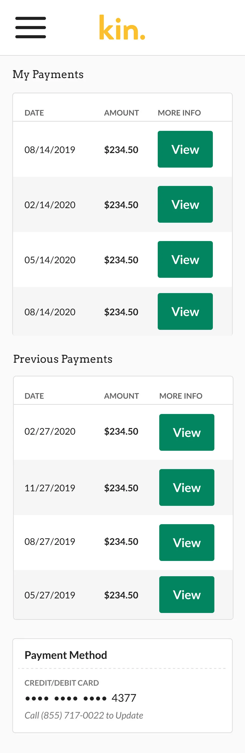
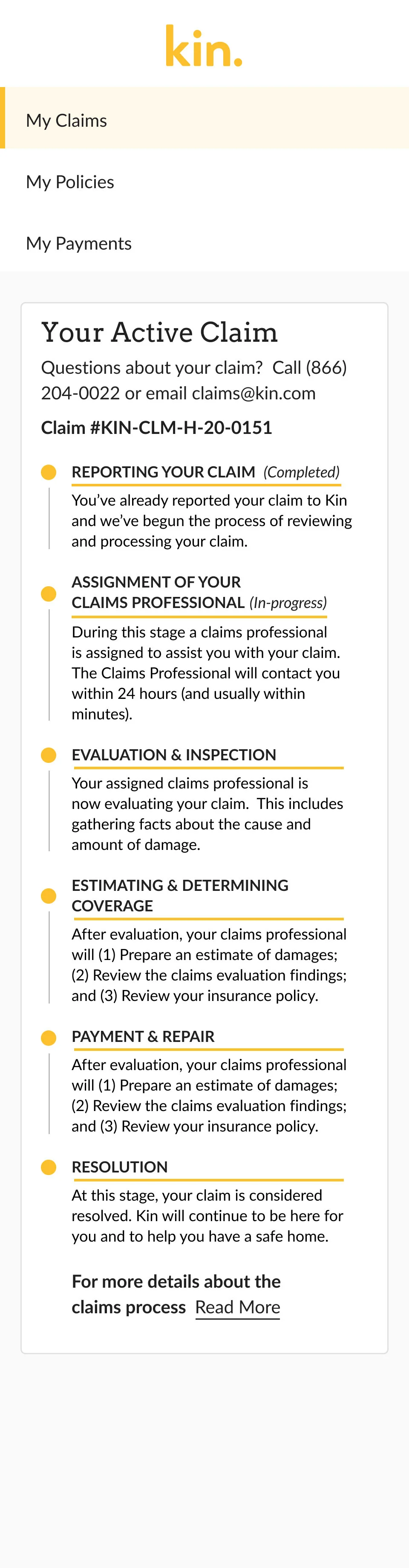
3.0 - Kin Customer Portal - Mobile
One of the projects I was tasked with was the redesign of the Kin Customer Portal, a place where our customers can access their insurance policy information and related documents. It became clear during our initial research that this was an important touch point for our users (customers). 70% of the customers we interviewed revealed that they prefer being able to access all of their documents in one place. Another aspect to this project that took a high priority was the need to lead with a mobile first design, as our user research pointed to the fact that most of our clients were likely to attempt to use the customer portal from their mobile device at least once during their 12 month policy life cycle.
My Role
Senior Product Designer
Pictured Below: My Policy / My Payments / Active Claim Tracker for Desktop


3.1 Understanding the Problem
Previous versions of the dashboard were not user friendly and had limited functionality. Going into this project there were engineering and time constraints, so it was important to maximize the current design system components while also gaining insights for future versions of components needed to continue the proper evolution of our design system.
3.2 Primary Goals for Redesign
Allow users to easily access important insurance documents & receive an alert when a new document is generated
Mobile first design
Work with current design system patterns
Add an active claims tracker
3.3 Exploring Possible Solutions
I decided to do some research on some of the better mobile experiences out there related to insurance and finance. I took inspiration from Capital One’s mobile experience, which features large easy to see buttons and touchpoints. After testing a handful of solutions, I produced a design that incorporated several user approved details that I uncovered throughout the research and design process. Some of those features included a mobile friendly menu, larger touch points across several mobile components including green call-to-action buttons and document icons (minimum 44 pixels according to Apple’s Human Interface Guidelines).
Pictured Below: High Fidelity Customer Portal Screens for Mobile (44 Pixel Touch Targets)


3.4 The Results
Goal 1: Allow users to easily access important insurance documents & receive an alert when a new document is generated
I accomplished this goal by adding working features like alerts, claims tracker and ability to view payment.
Goal 2: Mobile first design
Our users found the clean spaced out design with larger touch points easier to use than the previous design.
Goal 3: Work with current design system patterns
This project was completed using the current design system which helped with development constraints.
Goal 4: Add an active claims tracker
An active claims tracker was designed to scale for both mobile and desktop
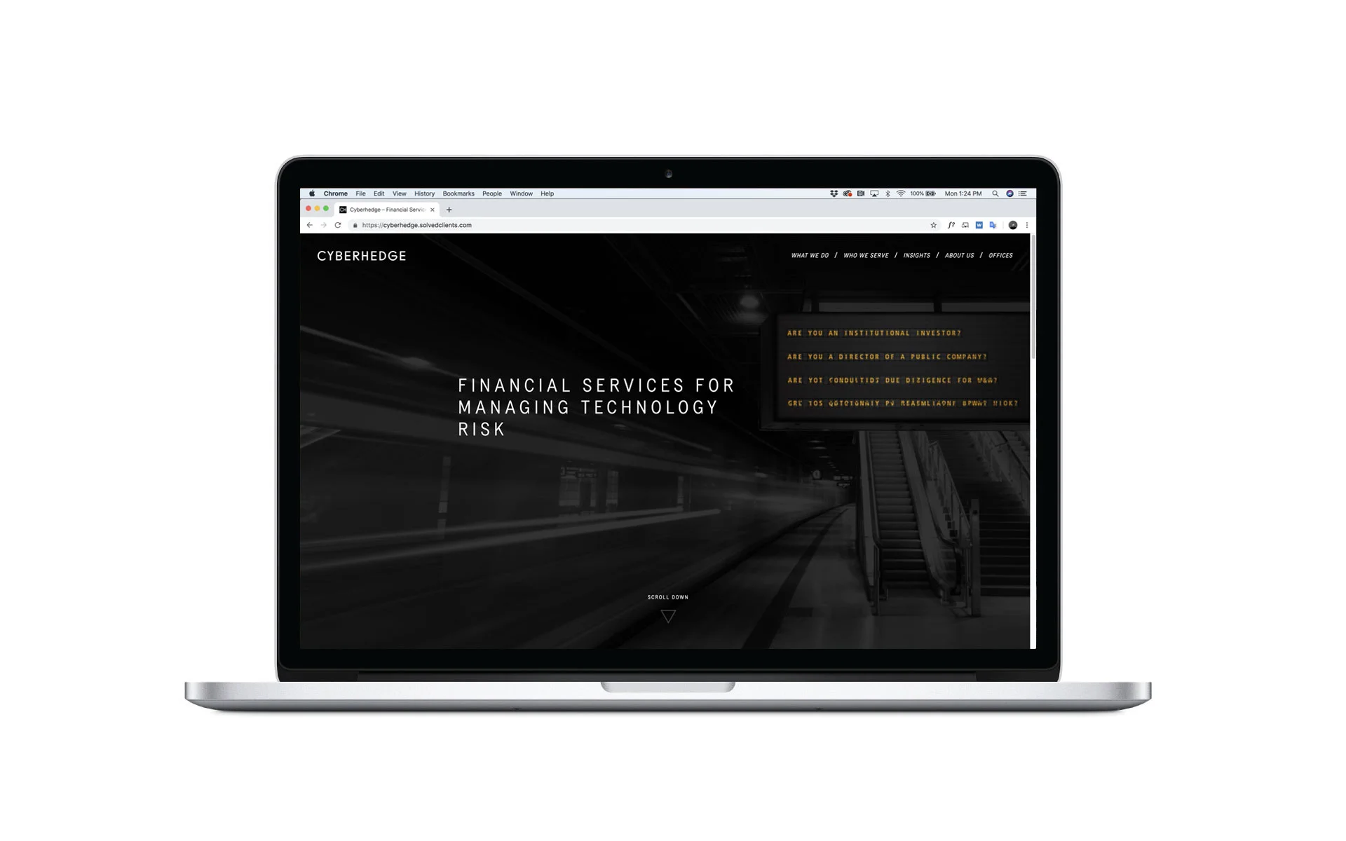
4.0 - Cyberhedge Website
I led a small team of developers on a complete redesign of Cyberhedge’s website. We created a familiar yet modern user interface, dramatically simplifying the user experience, focusing on core interactions, simplified navigation & speed. A stylish aesthetic was a necessary bonus.
My Role
Head of Design


4.1 Understanding the Problem
At Cyberhedge user experience and the overall look and feel of the brand was very important to its stakeholders. As a newly launched fintech startup who’s target audience was predominately c-suite executives, it was important that the Cyberhedge digital experience conveyed creditability. I was leading a smaller design team at Cyberhedge and there were significant time constraints as we needed to complete and launch the project in just a few months.
4.2 Primary Goals for Redesign
Create one unified digital platform that comprehensively conveys Cyberhedge’s products and services.
Incorporate Cyberhedge’s brand aesthetic in all aspects of the site, making sure it is a natural extension of the Cyberhedge brand.
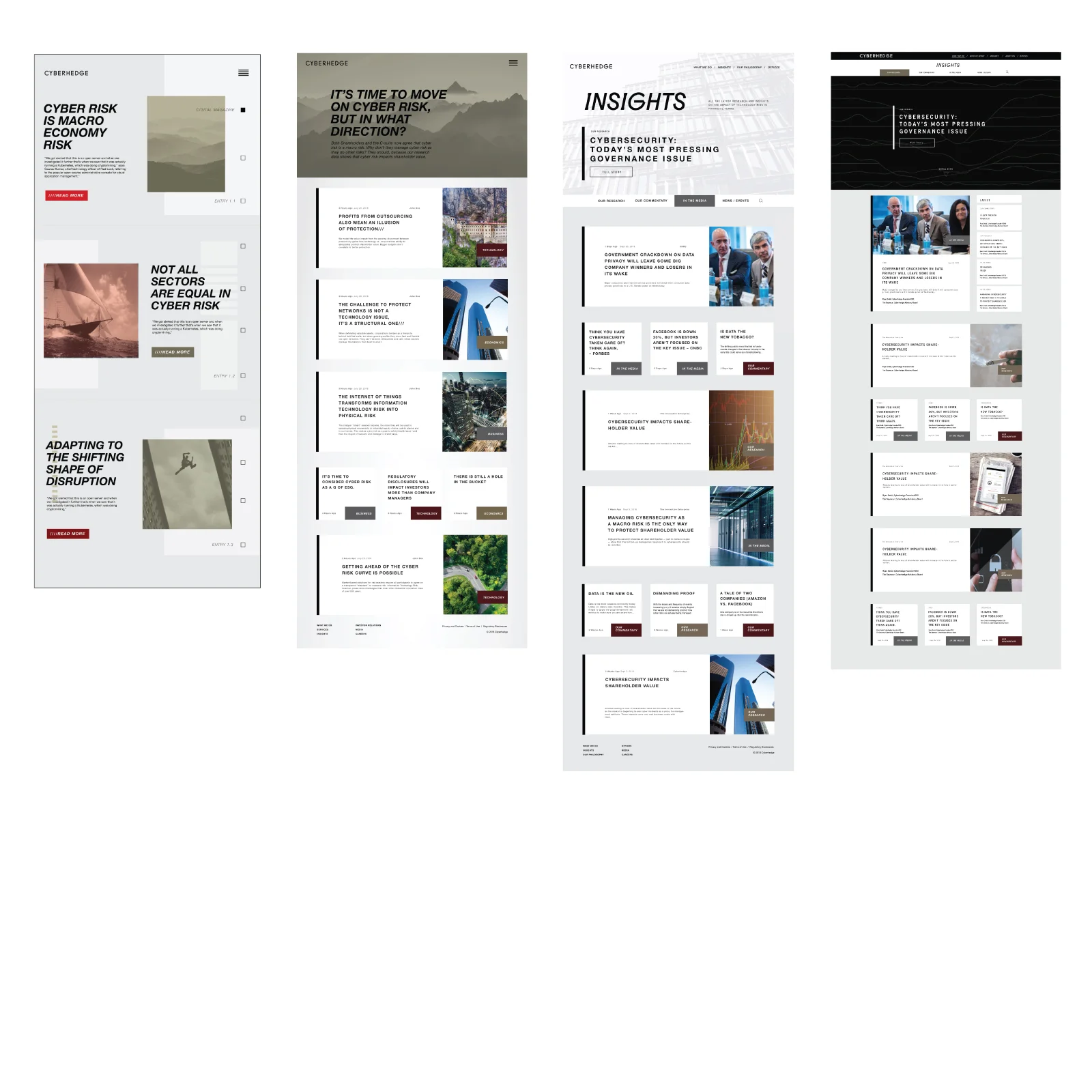
Establish Cyberhedge as a thought leader in the marketplace by allowing users a space to access the latest articles & information related to topics of technology, cyber risk and finance. This area, “Insights”, is a custom news style layout featuring articles accessible by topic, category and keywords. CMS built in Wordpress.
4.3 Exploring Solutions (Sitemaps, user flows, brand development)
Prototyping & Sketching Exercise
I conducted a meeting with stakeholders to better understand needed design elements from the Cyberhedge team’s perspective and sketched out initial site map and other necessary design elements.

Mood boards
The purpose of the mood board was to assist in providing a look and feel for Cyberhedge’s digital products. Cyberhedge’s digital reporting products were modern measurements of connectivity. We wanted to highlight “classic representations of connectivity” through photography.


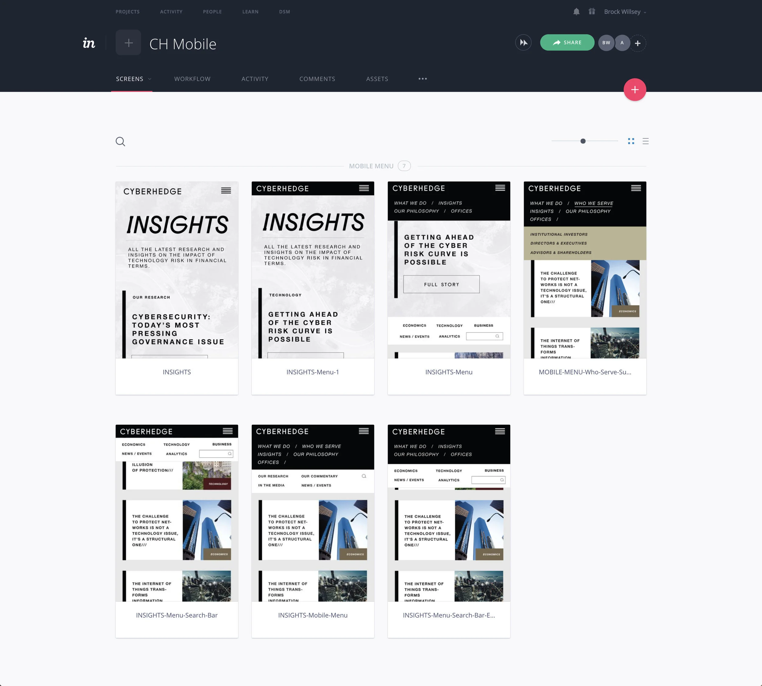
Wireframing (Mobile & Desktop)
After team feedback, we took a heuristic approach incorporating user research throughout the wire framing process. We worked through several low and high fidelity wireframes. I designed several wireframes for consideration for both desktop and mobile.


5.4 The Result: A Modern User Experience
The majority of what Cyberhedge does for its clients revolves around reporting & taking complicated data sets and putting those into terms that can be easily understood by c-suite executives and corporate decision makers. We had a distinct target market and demographic in mind and wanted the website to feel like the user was opening a well designed report while also making sure the site felt familiar and easy to navigate.
Goals Accomplished
√ Incorporate Cyberhedge’s brand aesthetic in all aspects of the site, making sure it is a natural extension of the Cyberhedge brand.
√ Establish Cyberhedge as a thought leader in the marketplace by allowing users a space to access the latest articles & information related to topics of technology, cyber risk and finance.
√ Speed and ease of use. The site should load quickly and allow users to get informed quickly. All use and function of the site should be familiar to our target audience, while still feeling modern and advanced.
Demo of Cyberhedge website:
5.0 - Cyberhedge Dashboard
Working alongside a Data Scientist on this project, I designed a customizable reporting dashboard. The dashboard’s primary user was Cyberhedge employees. The visualizations were designed to be customizable and available in PDF format.
My Role
Head of Design


5.1 The Challenge (Understanding the Problem)
Previous versions of the report were being generated via separate dashboards and data queries. The user had to customize the reports one at a time and then pull together the various elements needed. The challenge was to create one dashboard where the user could control and request all or various aspects of the report in one place and one transaction. My experience prototyping Cyberhedge reports when working on the Brand Design Guide gave me a point of reference from a visual design perspective going into this project.
5.2 Primary Goals of Redesign
Quicker turnaround times on report generation
Ability to generate and share a high definition customer facing version of the report
User customize data queries
Both reports and dashboard should emulate Cyberhedge brand aesthetic
5.3 The Process
Prototyping & Sketching
Met with stakeholders and data scientist to better understand user needs and the best data visualization solutions. Sketched out proposed user flows and necessary design elements.


Wireframing
After team feedback and conducting user research we worked through several low and high fidelity wireframes. I designed several wireframes for the dashboard interface and customizable reports generated with the dashboard. The final outcome was quite different from our original design hypothesis. We continued to make iterations to the dashboard and reports based on user feedback.
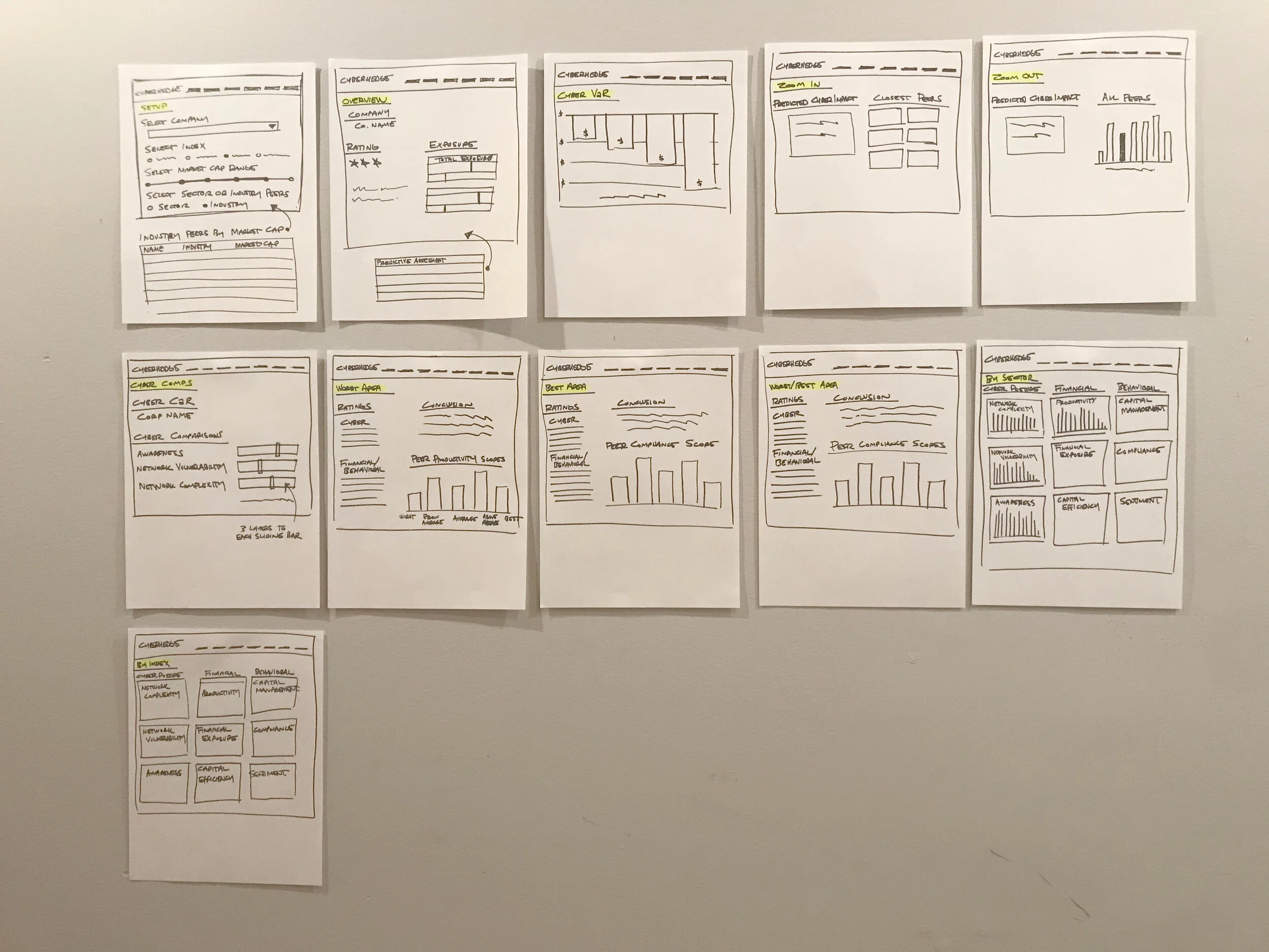
Pictured Below: Initial Report Wireframe Explorations (Black & White)
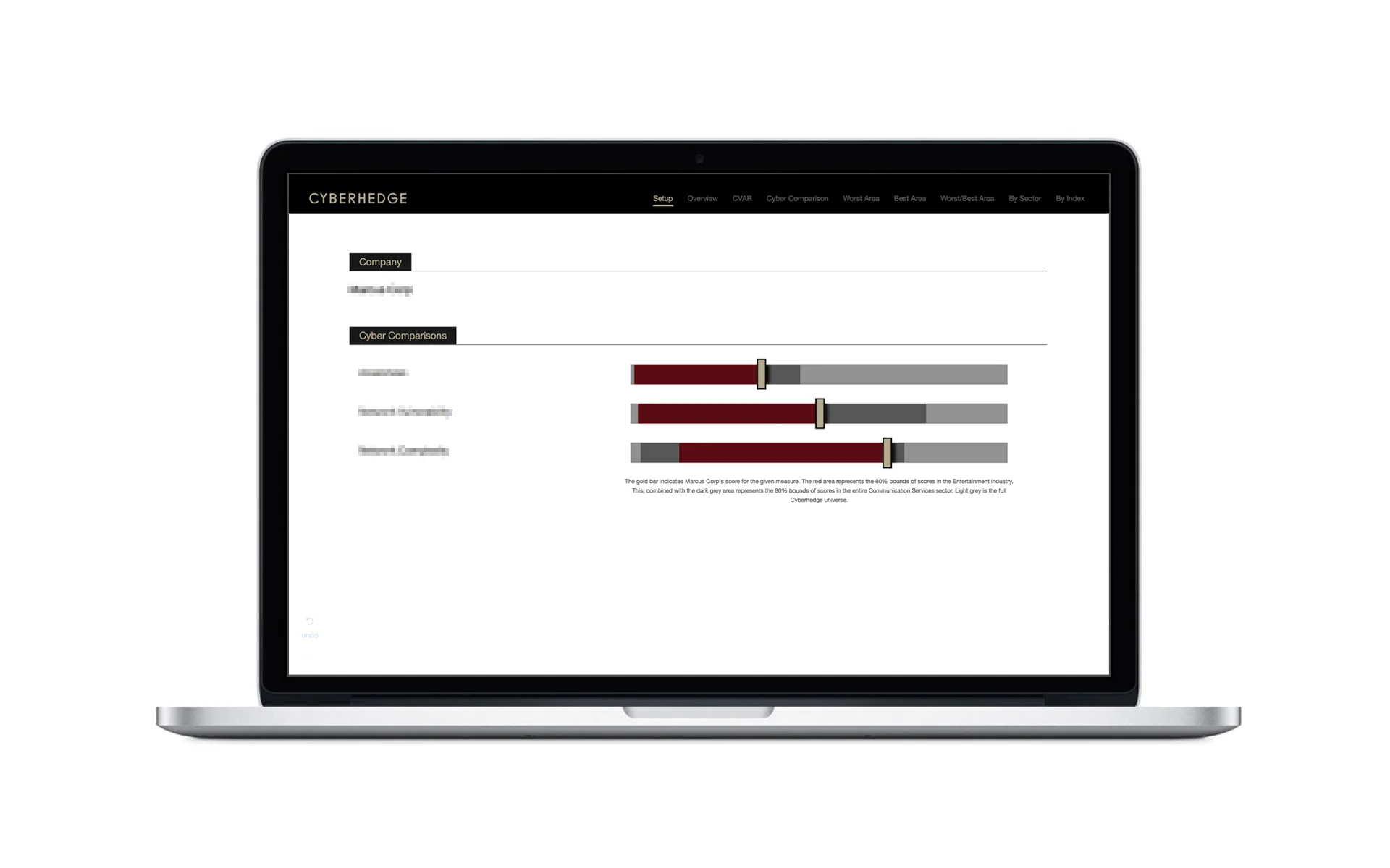
Research & Improve - Company “Clusters”
Each page and each data story presented its own unique set of challenges. Such as the need to display a large variance of corporations at once in a particular data visualization. The data stories being told often were about comparisons to other companies in a related field or industry. The amount of companies needing to be displayed at once depended on the “cluster” selected by the user and these clusters varied greatly in size. The original design attempted to make all three sectors visible at once, however we soon realized this approach had limitations.
Original cyber comparison wireframe:
As a solution we opted for the use of tabs on this section of the demo which allowed us to use the entire width of the display.
Improved cyber comparison wireframe:
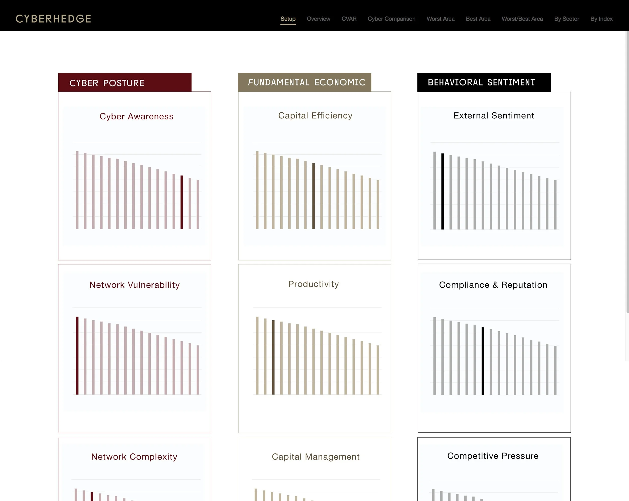
5.4 The Results: An Improved User Interface - Data Visualizations & Dashboards
Gaols Accomplished
√ Quicker turnaround times on report generation
√ Ability to generate and share a high definition customer facing version of the report
√ User customize data queries
√ Both reports and dashboard should emulate Cyberhedge brand aesthetic
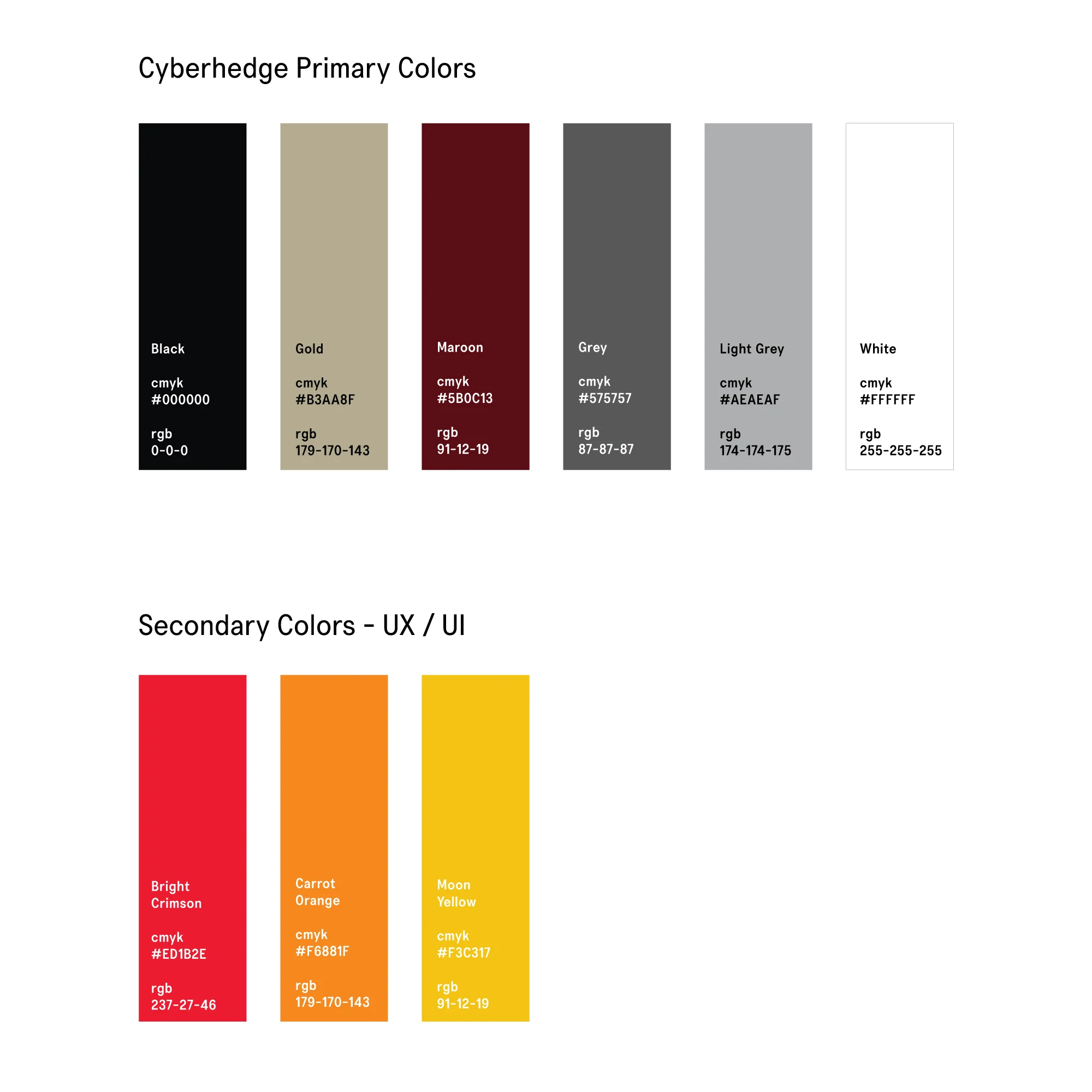
It was important for the dashboard to be a natural extension of the Cyberhedge brand. A key source of inspiration when designing the brand identity was Russian literature specifically from the Constructivism Period. One of the challenges we ran into when designing data visualizations was displaying data that needed to stand out as an alarm or to give warning. We needed bright colors but wanted to make sure these new colors played nicely with Cyberhedge’s current brand color palette.
We once again turned back to our Russian literature inspiration by using a color palette tool to extract two additional “bright” colors from some of our favorite Russian Constructivism paintings.
We found three great UX/UI complimentary colors that also serve a specific business function.

Client confidentiality prohibits sharing further product design case study information.
6.0 - 5thColumn INTERROGATE.IT Tool
When I was introduced to 5thColumn they were a fledgling start up with lots of momentum and fresh off of a successful round of funding. I was hired to help on several brand and design projects, one of them being to design a tool that helps cyber security engineers get better use of their internal monitoring software.
My Role
Lead Product Designer
6.1 Backstory (Understanding the Problem)
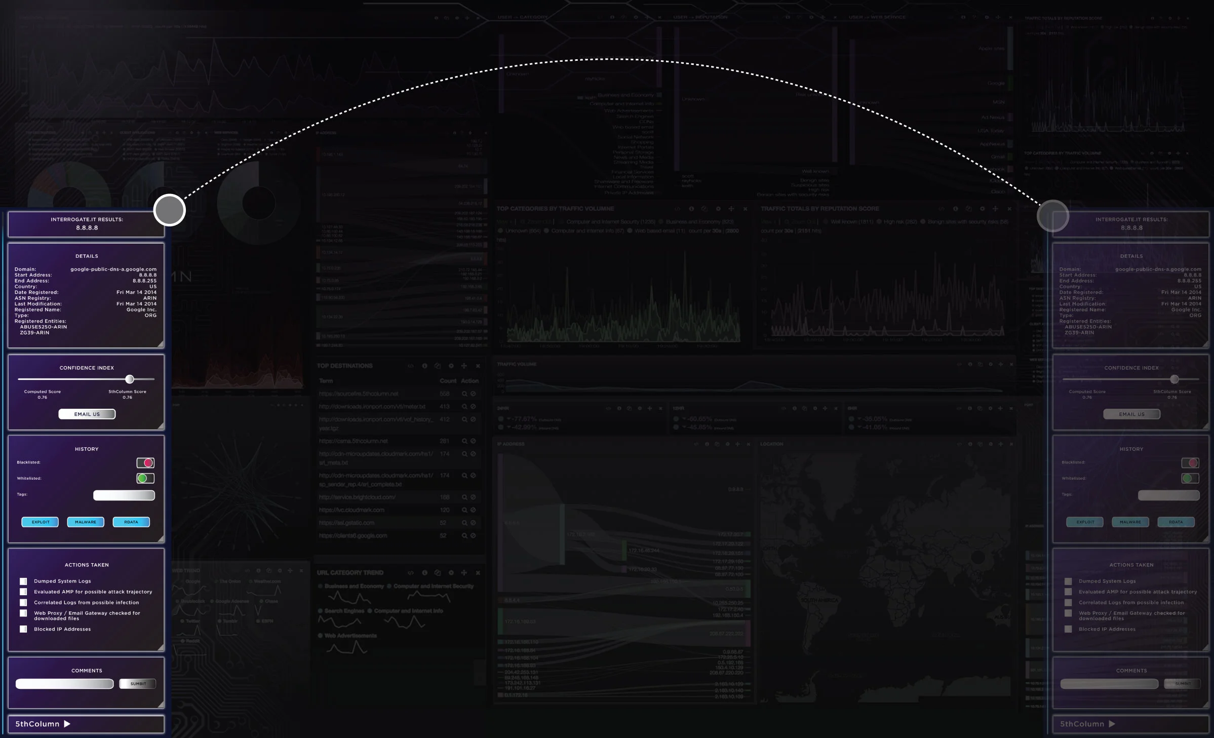
The effectiveness (or lack thereof) of cyber security software often depends on the ability to see irregularities when looking at an enterprise network. For example its like having a video surveillance monitoring system that runs 24/7 - everything is recorded but that information is only as valuable as the ability the user has to identify specific incidents within that never ending video feed. Cybersecurity software is similar in the sense that it is one thing to monitor incidents on a network, its is entirely another to identify those incidents in real time and take action accordingly. It is also important to create a baseline for an enterprise’s network and then continue to compare new data to previously collected data. 5thColumn’s INTEROGATE.IT software had no problem gathering the necessary information needed to properly monitor its clients networks, however there was room for improvement in providing the engineers who were using the software the ability to drill down into incidents and notate and tag them more quickly and efficiently. This helped define what was normal and abnormal and was especially useful over the course of time.
The INTEROGATTE.IT tool was designed to be dragged to either side of the monitor to give engineers flexibility when viewing the INTEROGRATTE dashboard.
6.2 Defining Primary Goals
Improve cyber security incidents visibility
Allow users (cyber security engineers) ability to drill down into incident
Allow users to make notes around any given incident
6.3 Product Solution Strategy
Developers needed to reduce response time on security alerts. Part of the required response includes going back through ticket items to trace problems to its origin and to compare to previous incidents. We identified the most important aspects of the monitoring process: Details, Confidence Index, History, Actions Taken and Comments. The tool was designed to make these five items easy to access and reference.
These items were placed inside of expandable and retractable panels within the tool to give more viewing control to the engineer.
6.4 The Results: Create, Browse & Compare Comments
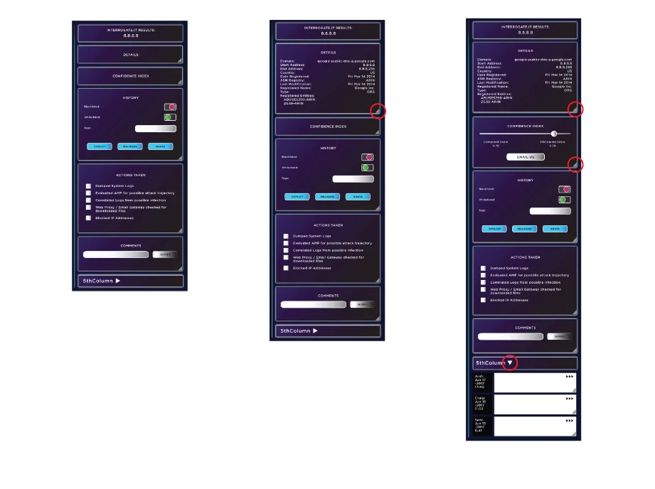
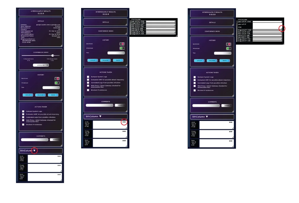
It was established early on during our creative brief that comments by engineers related to incidents was the most important feature of the tool. This feature needed to allow the engineer users an easy way to create, access and attach comments to specific incidents. We also needed to allow the engineers the ability to select and compare multiple comments - this was important to gauge irregularities over time.
An expandable panel at the bottom of the tool was created as the primary place to enter comments. An additional slide out panel was created to allow the engineer to “slide out” individual relevant comments. This allowed the user to continue to use the tool while also having the most relevant comments in place to quickly view and compare. The comments in the slide out panel also were expandable to easily see entire comments when necessary. It was important to give the cyber security engineers the ability to look back at ticket history quickly without having to go directly to the dashboard for ticket history information.
Accomplished Goals
√ Improve cyber security incidents visibility
√ Allow users (cyber security engineers) ability to drill down into incident
√ Allow users to make notes around any given incident
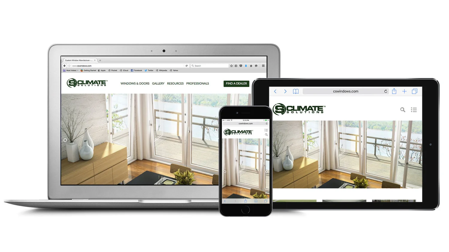
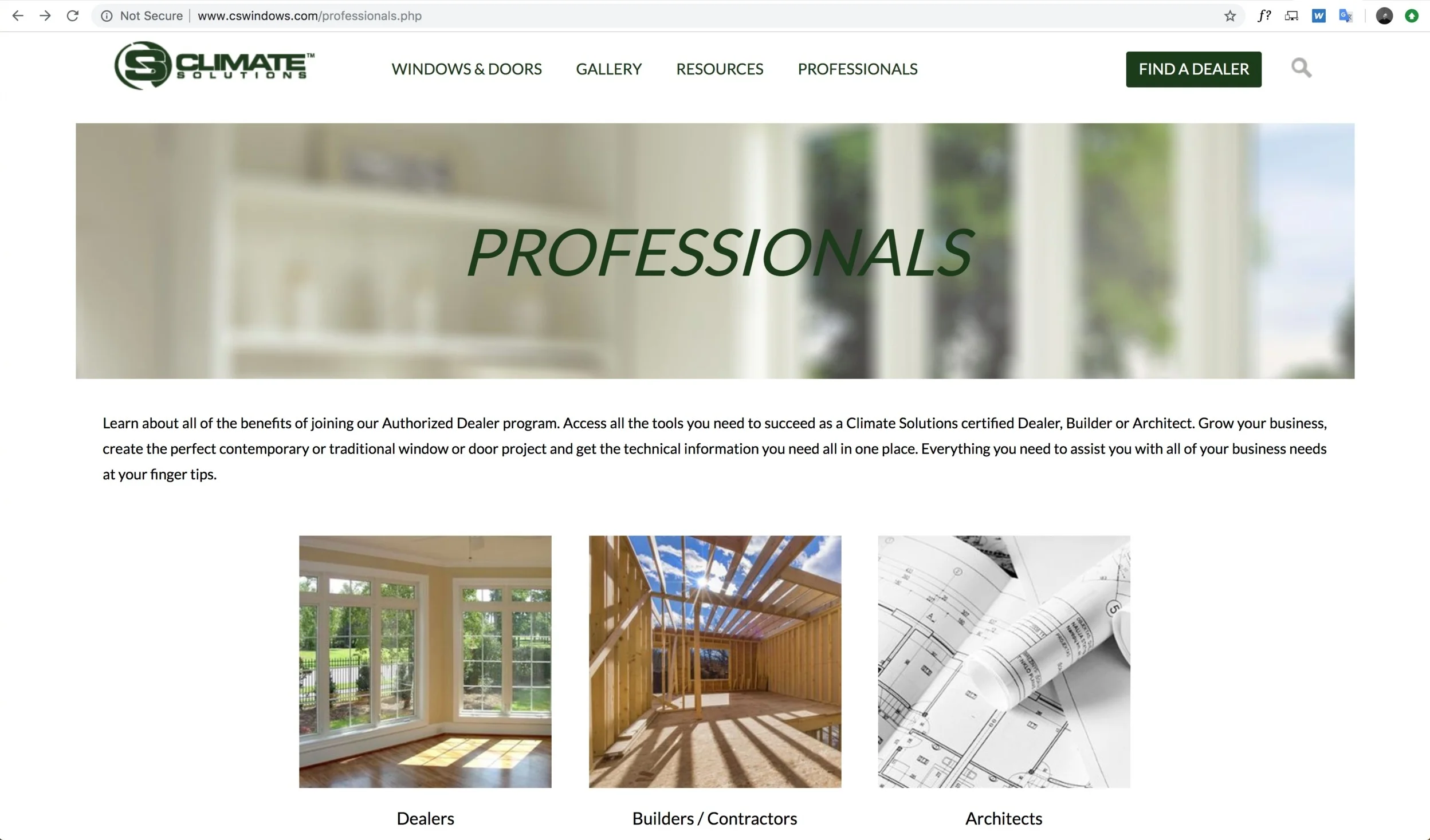
7.0 - Climate Solutions Website
Climate Solutions is a Chicago based window manufacturer that sells directly to architects and building professionals. The task was to redesign the company website and going into the project there were very specific business objectives. They already had a developer in mind that they had a long standing working relationship with and wanted me to coordinate and collaborate with him on this project.
My Role
Lead Product Designer
7.1 Primary Business Goals of Redesign
Carry over new brand identity from recently designed brand design guide
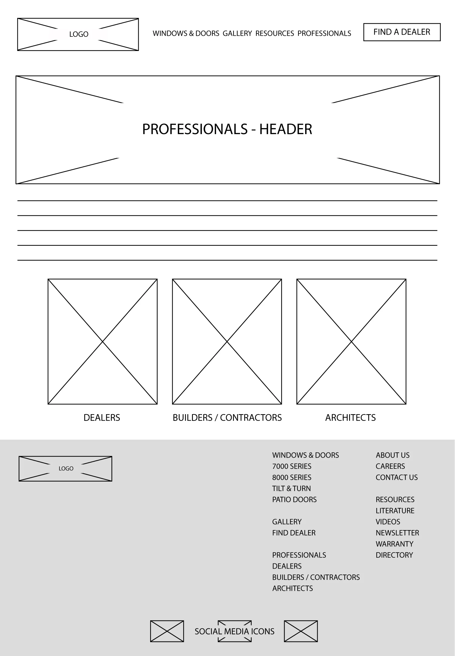
Allow contractors and architects the ability to login to the site and access sales and marketing tools along with their companies account information
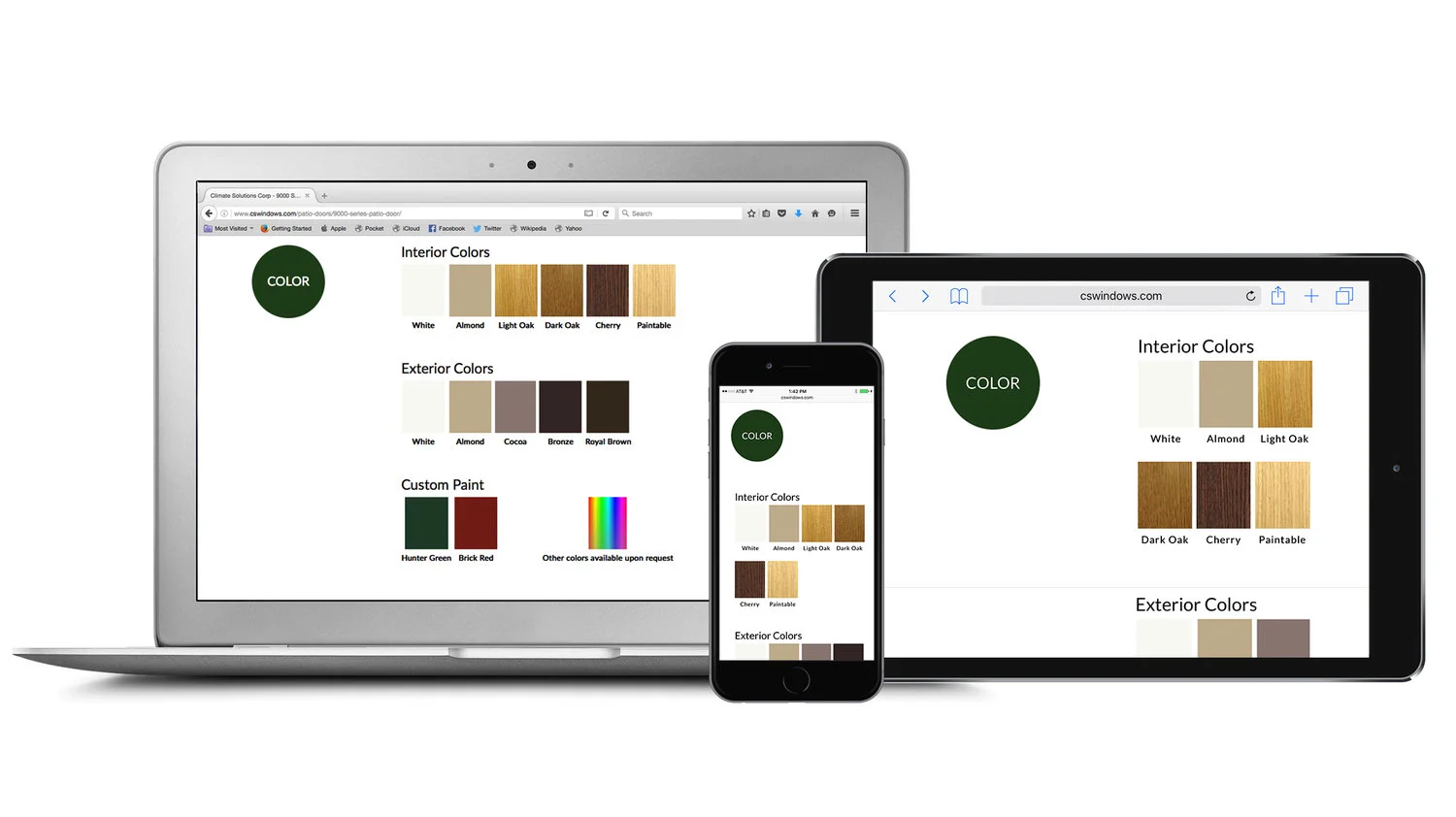
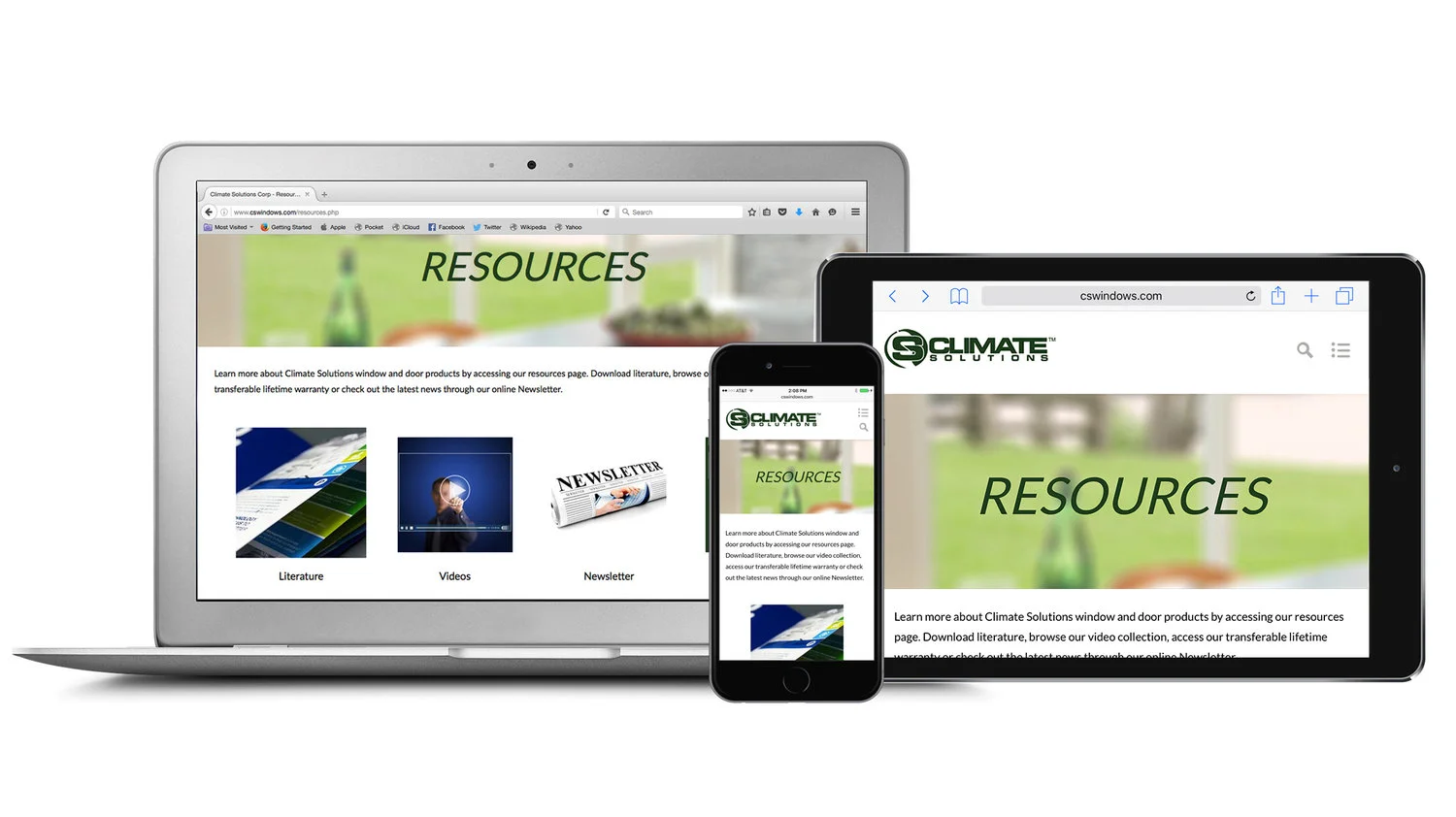
To showcase full range of window and door products in a clear easy to understand format
Drive customer leads
7.2 The Process: Design Strategy
Once I had a clear understanding of everything the client needed the site to accomplish I began to sketch out wireframes. The first thing I wanted to do before starting on design was familiarize myself with the developer’s work flow and process and how he preferred receiving prototypes and artwork. While I’m proficient designing products using Illustrator, Sketch, InDesign and a number of other software tools, it was important to make sure the developer was familiar with the same software tools to ensure a seamless work flow.
Homepage and Dealer Portal Page wireframes:

7.3 The Results
Dealer Portal
We created a portal that allowed three different types of Climate Solution clients access to account information, product information and sales tools. Because these three different types of clients had different business needs it was important to create individual areas that served different customer groups with different passwords and user logins. The backend content management system was built in Wordpress.
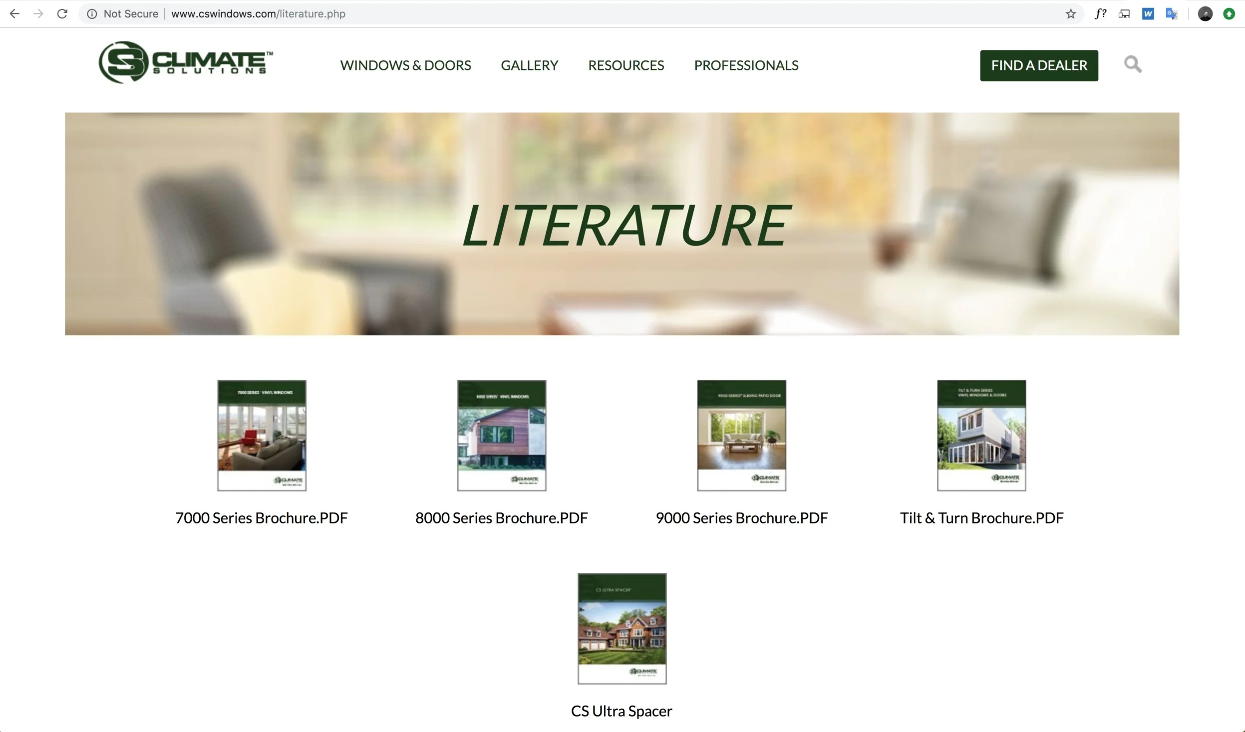
Product Information Readily Available
Before the website was built I did a brand identity redesign for Climate Solutions. One aspect of the brand identity redesign included new product literature. Previously the literature was always available in print form inside the Climate Solutions showroom and was often times mailed to dealers and architects per request. We wanted to create a place that Climate Solutions customers could easily access product materials. This helped cut down on printing cost, which is better for the environment and also more convenient for the customer.
Accomplished Goals
√ Allow contractors and architects the ability to login to the site and access sales and marketing tools along with their companies account information
√ To showcase full range of window and door products in a clear easy to understand format
√ Drive customer leads